
For the longest time newspapers, magazines and books had one advantage over content designed for websites. It’s rather a small feature, but one that makes content look so much better — the ability to wrap text around images and shapes other than a rectangle. But fear not, because with the help of a CSS feature called ‘CSS shapes’, you can now achieve that as well!
Since the beginning of the internet, we were trained to see our web sites as a collection of boxes. Even when we got a native CSS solution for creating circles, triangles and even trapeze and stars (either by using CSS tricks or by the modern clip-path property) these were all a mere illusion, since they’re still part of a box. As you can see in the example below, I’ve create a floating circle, which is basically just a div with a border radius — alas, the content still wraps itself around the circle’s box container:
The float area is a box, so the text can’t wrap itself around the real circle.
However, thanks to CSS shapes, we have the power to break this limit and make browsers wrap text around any crazy shape that comes to mind.
Circles, ellipses, complex polygons, you name it. We can even use images with transparent backgrounds and get the same effect!
Now we’ve seen it in action, how does CSS shapes work?
CSS shapes is a set of rules for wrapping content around custom shapes and path. It does not actually draw the shape, but rather gives instructions to the browser on what the float area looks like (We can still draw the shape using the clip-path CSS property, this feature just isn’t part of CSS Shapes). Currently it only works when paired with a float property (in the future, with the help of CSS Exclusions, it will be possible to do so without it). Also, it’s not possible to wrap text from both sides of a shape.
The CSS Shapes specification Level 1 defines three properties:
- shape-outside
- shape-image-threshold
- shape-margin
shape-outside
The shape-outside CSS property defines a shape around which adjacent inline content should wrap. By default, inline content wraps around its margin box; by accepting different functions, shape-outside provides a way to customize this wrapping.
Some supported values are:
circle()
.basic-circle {
width: 150px;
height: 150px;
shape-outside: circle();
float: left;
}
// Circle with a custom radius
.radius-circle {
width: 150px;
height: 150px;
shape-outside: circle(30%);
float: left;
}
// Circle with a custom radius and position (which defines the center of the circle)
.radius-position-circle {
width: 150px;
height: 150px;
shape-outside: circle(50% at 0 50%);
float: left;
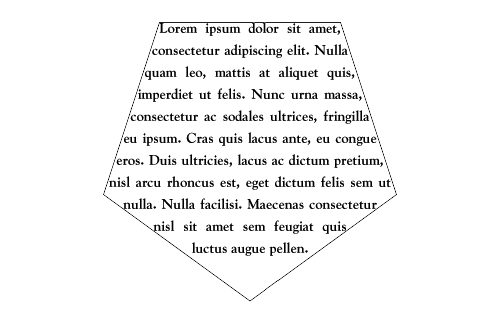
}polygon() —The polygon() function allows you to “go crazy” and create any kind of shape. It gets as an argument, a list of at least 3 coordinates. This, for example, is how you would create a simple 5 pointed star:
.star-shape {
  width: 150px;
  height: 150px;
  shape-outside: polygon(50% 0%, 61% 35%, 98% 35%, 68% 57%, 79% 91%, 50% 70%, 21% 91%, 32% 57%, 2% 35%, 39% 35%);
  float: left;
}
Creating shapes by hand is a bit of a pain, so you can use online tools such as this one to generate the correct CSS, which you can just copy-paste to your project.
url() — With this function you can create dynamic float borders from an image. It only supports png/gif/svg formats thought. Also note that you need the actual image present as an <img> tag for it to work.
<img src="some-image.png" class="custom-shape" />
<p>some text...</p>
<style>
.custom-shape {
  float: left;
  shape-outside: url(some-image.png);
}
</style>
Other supported shapes are ellipse() and inset().
Note: A useful property to use along with shape-outside is clip-path which takes the same values (except for url) and creates a visible shape.
shape-image-threshold
When using shape-outside along with an image value (using the url() function), the shape-image-threshold property is used to adjust the minimum opacity level of pixels that will be used to create the shape. Its value must be in the range between 0 and 1.
.shape-from-image {
  float: left;
  shape-outside: url(some-image.png);
  shape-image-threshold: 0.1;
}
shape-margin
If the shape you created with shape-outside is too close to the text, you can adjust its margin from the content using this property.
.circle {
  shape-outside: circle(50%);
  shape-margin: 20px;
  float: left;
}
Browser Support
Unfortunately CSS shapes level 1 is not supported by IE11 and not even by Edge, however support from other browsers is not too bad! You can still make your page look better on these, and just let them fallback to the old behavior on non supported browsers, or you can use a polyfill, created by Adobe.
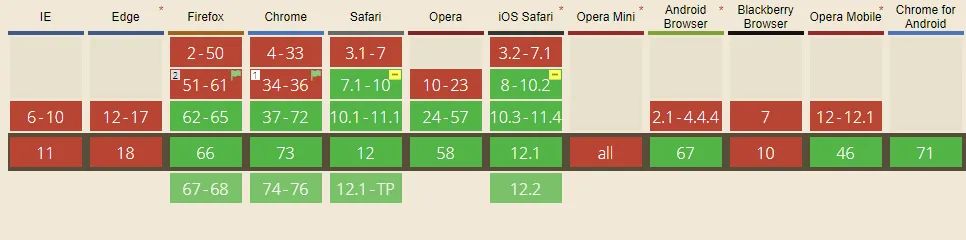 https://caniuse.com/#feat=css-shapes
Future Features
Currently we can only float text around shapes, but when CSS Shapes level 2 hit the shelves, we will get a new feature called “shape-inside”, which will let us put text inside shapes!
https://drafts.csswg.org/css-shapes-2/#shape-inside-property
Conclusion
We learned that we can break the limits we were previously set, and by using some simple CSS, make our web pages more interesting to look at! I really hope this little article will inspire you to test these neat features :)